
 Something changes on Facebook just about every day.
And significant changes to the Timelines for business pages now have page owners scrambling.
The new Facebook Timeline basically contains 6 major annoyances, which I will get to in a second.
First, a word of advice:
Don't waste too much time on the design of your Timeline.
Hardly anyone visits that part of your page anyway.
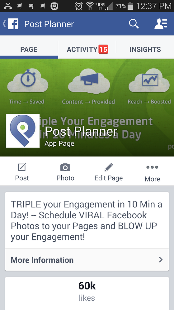
Post Planner has more than 60,000 Likes -- and only about 300 people visit our Timeline each day.
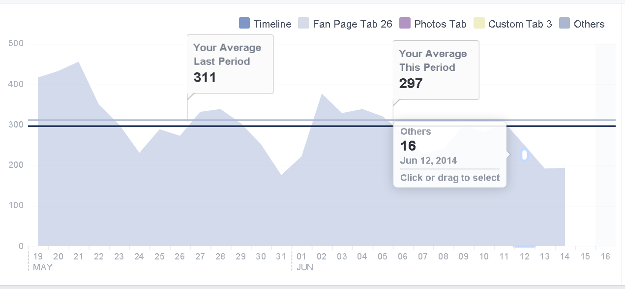
That's fewer than .5% of our fans.
Every fan is important, but I don't waste a lot of time designing my Timeline because most fans will never see it.
And with the shift to mobile devices, even fewer people will leave the news feed to visit your page.
With that said, here are 6 Timeline changes that are REALLY bugging me:
6 Things I Hate About the New Facebook Timeline for Pages
1. Jacked Up Cover Photo
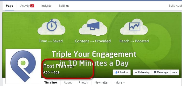
The name & category of your page now appears on top of your cover photo -- as do the Like, Follow & Message buttons.
So text or photos on the lower portion of your image get covered.
There's also now a shadow effect near the bottom of the cover photo. This makes the cover photo appear awkward & less polished than before.
Make sure these changes haven't caused text or imagery on your photo to be covered.
>> Click to Tweet <<
2. Annoying Message Pop-Ups
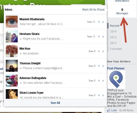
Facebook moved your messages to the right side of the page & under the Activity tab above your cover photo.
Now when you click "Messages" on the right side, your messages load in a pop-up:
Click a message & another pop-up appears:
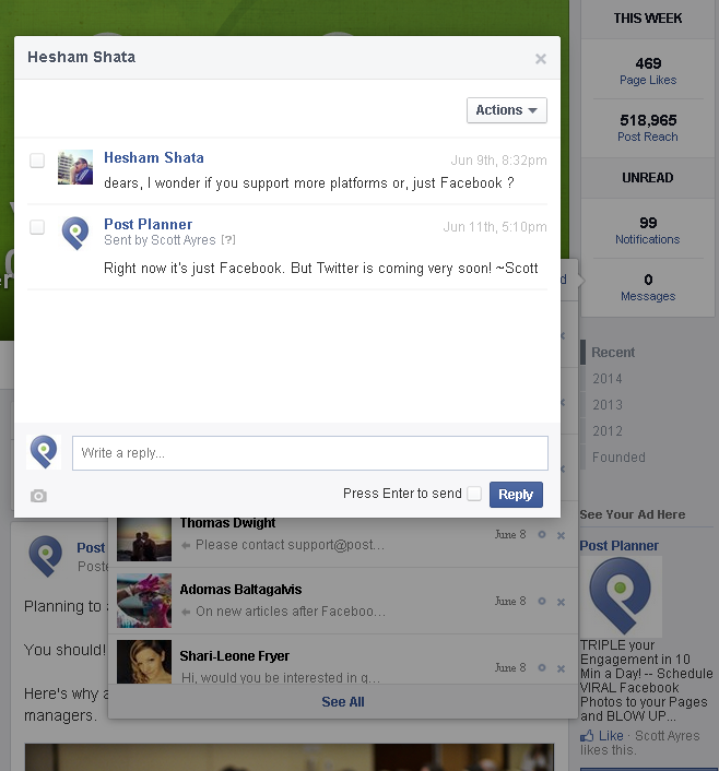
This might get annoying on a laptop or a device with a smaller screen.
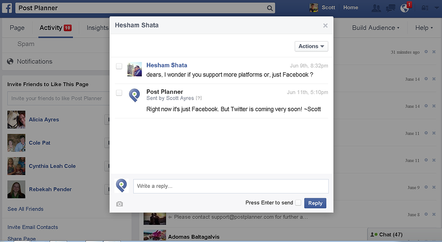
The same pop-up function appears when you access messages via the Activity tab:
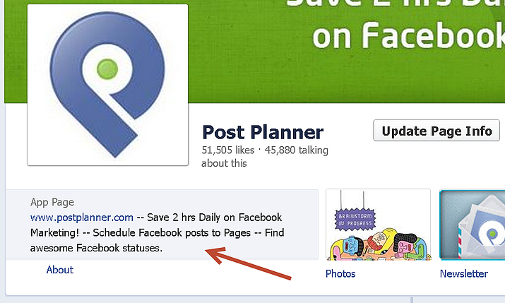
3. About Section Pushed WAY Down
The About section used to be very prominent on the Timeline & was just below the cover photo -- as shown here:
Now the About section appears lower on the left side of the Timeline:
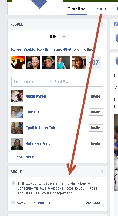
Before, when fans visited a page, they saw an About section & clicked a link.
Now visitors won't likely scroll low enough to even see the About section.
Still, make sure your About section contains a brief description & URL.
4. Useless "Highlight" Feature
One of the coolest functions of the old Timeline was the ability to "Highlight" a post, which displayed the image the full width of the page.
This was great when you wanted to emphasize a photo or announcement.
Though there are no more full-width posts, Facebook still lets you highlight:
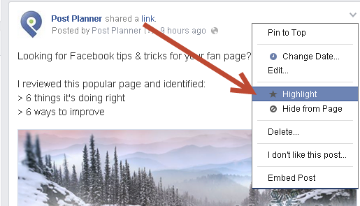
When you highlight a post, the post is displayed with a banner:
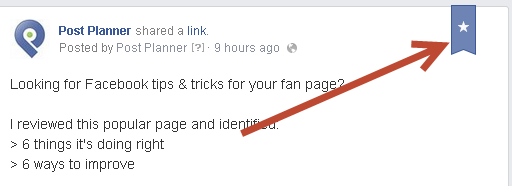
But when I refresh the page, the banner goes away!?!?
Facebook either forgot to remove Highlight from the settings OR they have future plans for the feature.
5. Changes to "Posts to Page"
Before, when someone posted a spam message on your Facebook page, you quickly saw it and could click "x" to either hide or delete the post.
That's changed.
Everything posted on your page by users now shows up on the left sidebar:
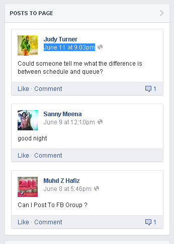
But from there, you can't delete or hide the posts!
To delete a post, you must click the date & time stamp or "Posts to Page":
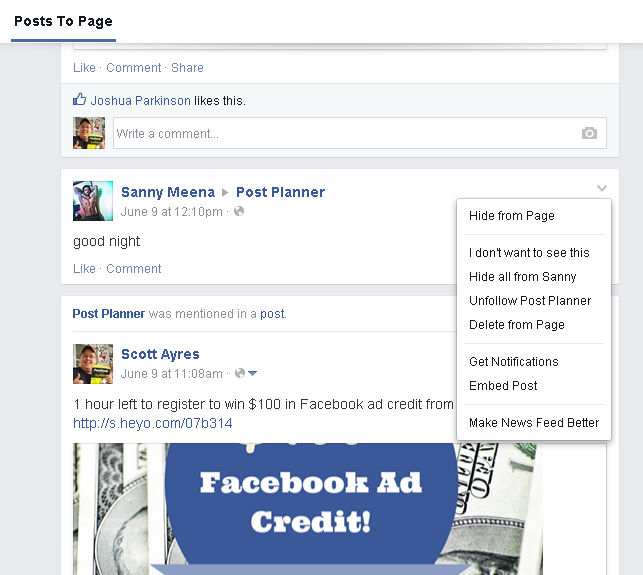
For pages that get lots of spam, this is an annoying added step.
6. Cover Photo Looks Crappy on Mobile
The new Facebook cover images don't look great on mobile devices:
The profile image covers part of the photo & is positioned differently than on the desktop.
You'll also see something different via the Page Manager app on your phone:

Keep your cover photo simple with the most important text & images in the center so they show up well on mobile devices.
>> Click to Tweet <<
Conclusion
Have you noticed these changes?
Are you annoyed?
Maybe I'm just making a big deal out of nothing. What do you think?


No Comments