
![]() In a landmark move, Twitter has completely redefined what is considered a landmark move.
In a landmark move, Twitter has completely redefined what is considered a landmark move.
If you who haven't read Twitter's press release about why they changed their logo, you should head over now and check it out.
Then let me know what it said, because I haven't bothered to read it.
Drumroll, please...
Please, ladies and gentlemen, contain your orgasms.
I know we're all feeling the same thing: What an obvious improvement to a terrible eyesore.
With the old logo I wasn't sure whether Twitter wanted me to join their social network or erase the Twitter brand from my brain with a power tool.
I mean, we haven't seen an improvement this significant since the color beige stopped being so tan.
Lab coats, everyone!
Time to crack open a big can 'o science.
Some people believe the new Twitter logo is an obvious redesign to signify Twitter's success.
They say the upturned beak signifies the company's great earnings outlook, and the aerodynamic body represents Twitter's streamlined and more reliable service.
Clearly those people are idiots.
 Certainly something more sinister...
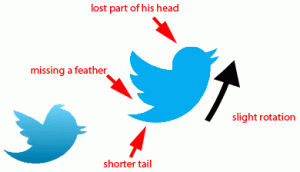
Before, the tail was more stretched out and pronounced, like a stubborn booger that can't decide whether it prefers your finger or your face.
Now they've shortened it, as if to say Twitter has matured. It's a more weathered, wise, adult company now.
It dresses itself, and doesn't have time for silly things.
Probably the most characteristic change, though, was to the bird's whisp of feathers on its head. While many criticized this as an excessive show of plumage, I saw it as a sign of ruddy sophistication.
Twitter, however, decided to ditch the charming look and make their bird balder than Patrick Stewart practicing fire-breathing in a hairspray factory.
Plus, it was always curious how the plumage faced forward, begging the question: just which direction is that bird going? What sort of aerodynamic wizardry is this? It was intriguing -- and in business, intrigue is to customers as a saddle is to a horse.
So shut up and take my money already.
Predictions:
If you look at the history of the Twitter logo, it's obvious it was designed by someone with obsessive compulsive disorder.
And it's obvious this person is becoming more neurotic with time, making ever more minute changes until the logo is absolutely *perfect*.
Luckily, the company has provided a handy graphic of previously inferior Twitter manifestations:


Where it goes from here
So far in the logo evolution we've seen:
- removal of a feather
- counter-clockwise rotation
- shortening of the brain region
- stubbing of the tail
I believe this pattern will continue.
Using sophisticated modeling techniques, we've created a projection of what the Twitter logo will look like three updates from now:
I know what you're thinking: I haven't even mentioned the color yet.
Before it was a blue gradient... and now it's brighter, lighter and solid-tone. That's significant, right?
No. You're terrible at this.
Please, leave the science to us professionals.


No Comments