
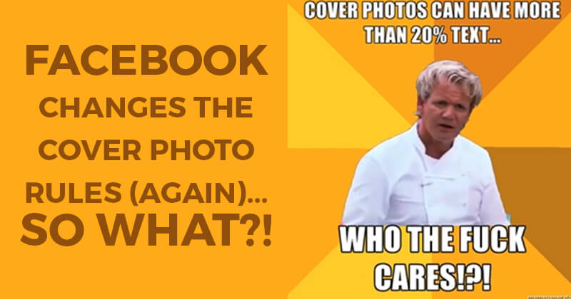

Apparently Facebook has relaxed the "Rules" for cover photos on fan pages.
This time by removing the "20% Text Rule".
The news was first announced by Tabsite -- and then every social media "expert" & marketer weighed in with orgasmic elation about the change.
I personally don't see what all the fuss is about.
But Tabsite definitely did a great job of jumping on the news before anyone else.
Here's a nice graphic they put out:
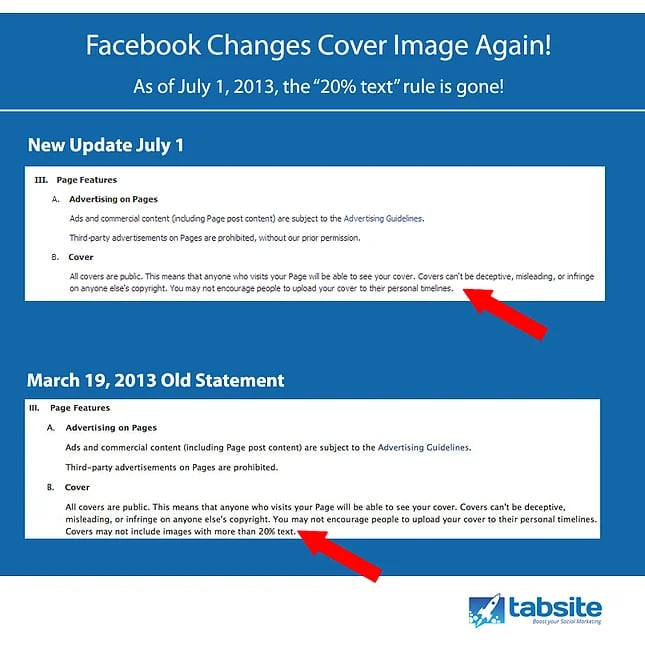
Keep in mind that Facebook's Help Desk is still mentioning the 20% text rule.
And I haven't seen any "official" word from Facebook on whether this is a sanctioned change to their cover photo guidelines -- or simply a mistake in wording.
Even if this is a legit change & all restrictions on cover photos have in fact been lifted -- I still want to warn you not to go ape shit & throw up a cover photo like this:

So What Should You Do?
In my opinion -- nothing different than you were doing before.
Except now you don't have to be as anal about the text.
Remember -- Only a handful of people will ever see your cover photo anyway. Almost no one returns to a page & visits a timeline after liking it.
Yep, almost no one.
So you shouldn't spend too much time focusing on how pretty your Timeline is.
Granted, Facebook has been testing some new kinds of "Like" stories --as seen below -- where the top half of cover photos shows up in the news feed when a friend Likes a page.
But again, less is more here.
My Tips on Cover Photos Going Forward
>>> Brand don't Market
Your cover photo on your business page is for BRANDING not marketing.
Maybe you mix in some marketing messaging here & there -- but if you fill the image with salesy text, no one will notice or care.
On the Post Planner fan page, we just mention a few features in a non-pushy way:

>>> Less is Still More
People will be overwhelmed by your cover photo if it's full of text & images -- especially when the text is of varying colors & fonts.
By far the company with the best cover photos on Facebook is ShortStack -- these guys just have awesome design all around.
For example, I love how this cover below flows & gives people calls to action & direction without overdoing it:

>>> Photos Speak Volume!
While I'm not a big fan of companies posting random pictures of their employees around the office -- a cover photo with your staff is a great idea because it builds a personal relationship with your fans.

Hearsay Social did a great job with this on one of their past cover photos.
And what if you don't have a staff to take a photo of?
No worries, just do what Trulia or Square did and show off your product:


Bottom Line
Just as I recommended not being a Facebook Hashtag Douchebag when hashtags launched, I'm recommending not being a Cover Photo Douche now!
Instead, be professional & smart with your cover photo.
Here are a few cover photo resources to help you:


No Comments