

 Ever been designing an image and thought to yourself:
"Man... I wish I had the graphic design skills to make this image AMAZING!"
Don't worry. We've all been there!
And lucky for us, Canva just introduced a simple-as-pie new online Design School that empowers everyone to learn AMAZING graphic design skills.
Yes, it’s for people just like us -- businesses & brands communicating through social media!
The school includes a series of quick & easy tutorials that cover everything beginners need to know about design.
So if you want to become a better visual communicator, here’s a taste of the powerful graphic design hacks you’ll learn at the Canva Design School.
10 Graphic Design Hacks that'll Make You a PRO Designer Overnight!

1. Pair Contrasting Fonts
Which fonts look good together & which ones don’t?
Pairing fonts is one of the most common areas that stumps people who are starting out with graphic design.
>> Click to Tweet <<
A great rule of thumb is to choose fonts with high contrast. This will help the fonts balance each other out while still creating a feature in your design.
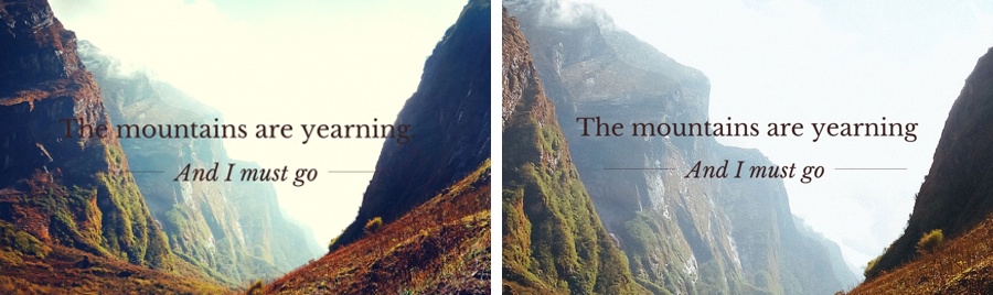
In this example, the font Sifonn was used for the word "Hawaii" and the font Arvo for the supporting text:

The contrast between the 2 typefaces has been increased by making the size of the title significantly larger & using a bright color to complement the background ocean image.
2. Match Colors Within Your Designs
Creating color harmony is one of the most effective ways to make your designs stand out.
>> Click to Tweet <<
One way to create harmony is to match the colors you use for your graphic elements -- such as fonts or text holders -- with a background image.
You can find the exact color from an image using a color picker tool, which will provide you with a hex code -- the six digit code that identifies an exact color on the color wheel.
Hex codes are an important concept for graphic design newbies to learn. They’re what you’ll use to construct all the color palettes for your designs!

In the example above, matching the text color with the vibrant pink flowers in the background image helps the copy stand out.
A transparent shape has also been added as a text holder to help with legibility.
3. Use Grids for Your Images
Grids are a unique Canva tool which help you layout & edit your images to create professional effects.

Four images with similar themes were placed in this grid to create an eye-catching composition. The horizon line of each photo has been lined up, and a unique filter was applied across all the images for consistency.
Grids make for a quick & easy way to create your own world class layouts without using design templates.
4. Add Transparent Icons
Learning how to create backgrounds in Canva is where your creative juices really start to flow.
Whether you’re using an image as a background or a series of colored shapes -- there are endless ways to experiment!

In the example above, a slight transparency was applied to the leaf icon & the background image was darkened to make the text more legible.
5. Illustrate Information with Shapes & Icons
Many people are surprised at how much they can accomplish using shapes & icons.
From creating informative infographics to a unique text holder, this is an important skill which helps you think outside the box & create original designs.
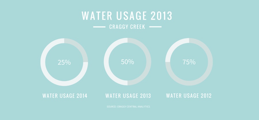
Three circle icons representing different percentages were used in this example to illustrate the findings of a report.
Shapes & icons are great tools to use when creating interesting & informative social media posts, or if you want to wow your boss during a company presentation.
6. Fix Color Issues in Your Images
Making sure your images look their best is an essential part of the graphic design process.
One way to do this is to increase or decrease the saturation of an image. Saturation refers to the intensity of color in an image.
When a color is fully saturated -- it appears vivid & bright!
>> Click to Tweet <<

Increasing saturation will make the colors in your image appear richer, while decreasing it will made them look washed-out & muted.
In the above example, saturation was increased to brighten the natural color of the fruits.
7. Crop Images to Maximize Copy Space
Copy space refers to empty areas within images.
When searching for background images, look for ones with ample copy space that you can use to overlay text. Or, to create more white space, try enlarging your images.
8. Choose Consistent Elements to Enhance Your Branding
Consistency is one of the important skills brands must master when using colors, fonts, logos & images.

These 3 designs feature a consistent layout seen through the repetitive placement of text, use of typefaces & color palette.
This helps achieve visual recognition -- which is an important element of your company’s communication with the world.
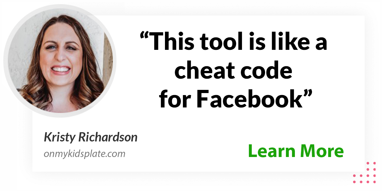
9. Design Visual Assets for Social Media
Along with posting regularly to social media, designing visual assets for elements such as your profile picture & cover image is essential.

Visual principles apply just as much to social media as they do everywhere else.
In the example above, the Facebook cover & profile picture complement each other. The purple logo was color matched with the background image.
10. Design Themed Presentations
Do you need to create presentations at work or school?
Great design can help your ideas stand out & read effectively -- improving your ability to become a great communicator.

In the slides above, the layout, use of fonts & photo filter were all applied consistently.
Changing the size of the text also helped create typographic hierarchy, which refers to the order the text is read.
How You Can Apply These Skills
Visual communication is as important as literacy in today’s workplace!
Now Canva's Design School can help you develop your visual voice & understand basic graphic design skills, even if you don't have any previous design training.
So what do you think? Like what you see?
Awesome!... Now it's time to dive deeper!
Grab your copy of our free visual marketing ebook below.
You'll be glad you did!


ViewHide comments (33)